E.S. Pilates
A modern pilates brand identity designed across print and digital.
(Year)
2025
(Services)
Branding, Print, Digital
Modern
Wellness
A Pilates brand rooted in movement, awareness, and flow. Private and small group sessions blend traditional practice with mindfulness to create balance and body–mind connection.
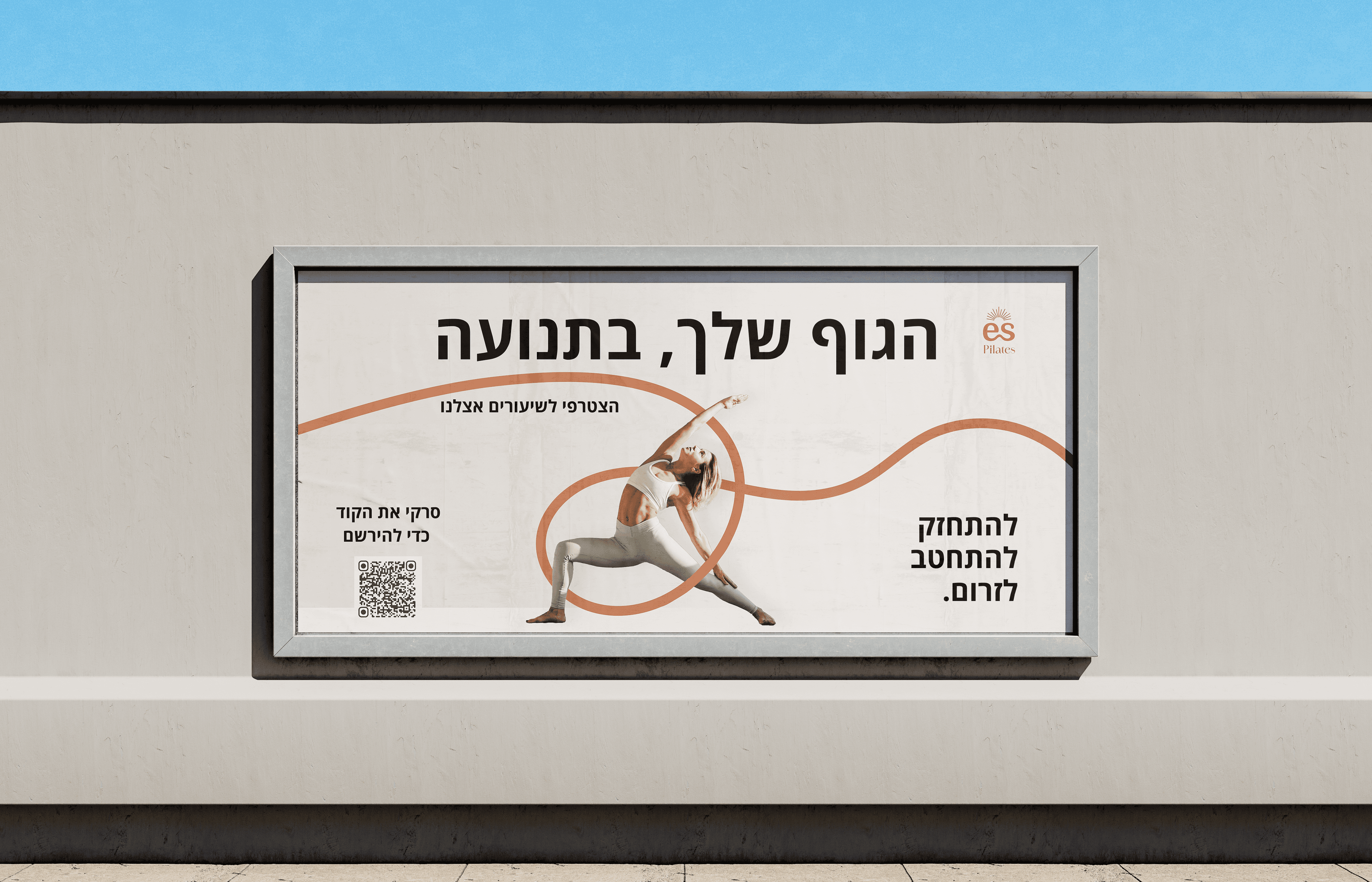
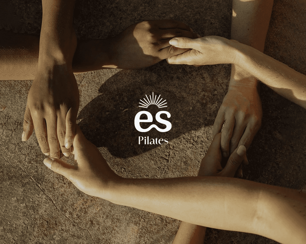
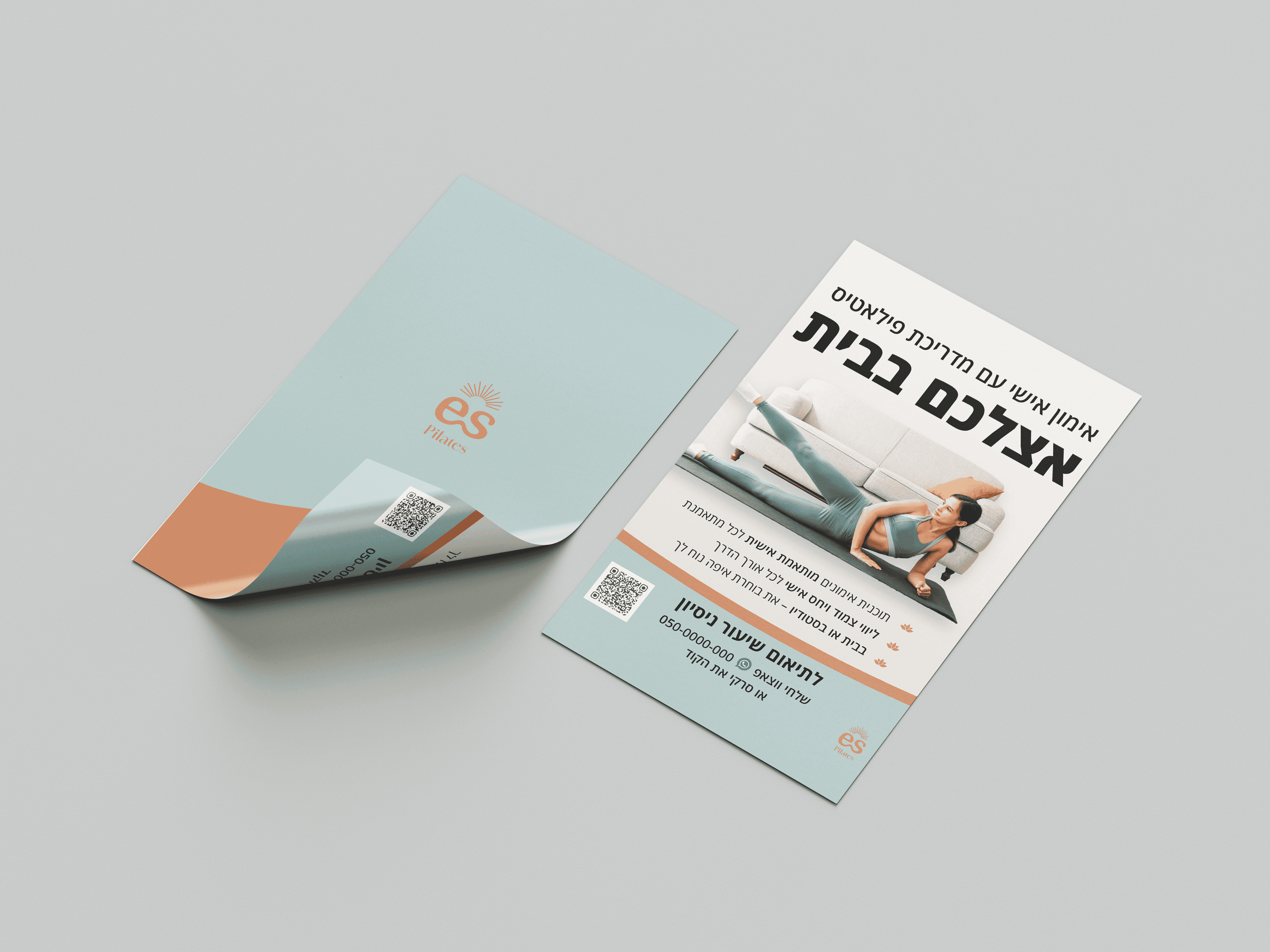
The project began with defining the client’s vision for a calm, warm Pilates brand connected to nature, which was translated into a clear visual direction through a moodboard balancing natural tones with a professional, approachable feel. A typographic logo based on the Domine typeface was developed to suit the brand’s initials, with a custom sun element added to symbolize vitality, flow, and the body–mind connection central to Pilates, later refined and paired with Amandine for added elegance. The logo system was designed to be versatile across a warm, earthy yet airy color palette, ensuring consistency across print and digital. Supporting typography (Jost for English and Open Sans for Hebrew) was chosen for clarity, accessibility, and cross-platform reliability, resulting in a cohesive, flexible brand identity that feels grounded, modern, and inviting at every touchpoint.
Challenge
The brand needed a modern, bilingual brand identity that communicated a calm, nature-connected approach to wellness. The goal was to build a professional yet approachable presence that could scale seamlessly across both print and digital touchpoints.
Strategy
I designed a grounded visual system using an earthy color palette and a custom typographic logo featuring a sun motif to symbolize vitality. By implementing flexible bilingual typography, I created a cohesive, inviting brand experience that stays consistent from printed flyers to social media campaigns.


E.S. Pilates
A modern pilates brand identity designed across print and digital.
(Year)
2025
(Services)
Branding, Print, Digital
Modern
Wellness
A Pilates brand rooted in movement, awareness, and flow. Private and small group sessions blend traditional practice with mindfulness to create balance and body–mind connection.
The project began with defining the client’s vision for a calm, warm Pilates brand connected to nature, which was translated into a clear visual direction through a moodboard balancing natural tones with a professional, approachable feel. A typographic logo based on the Domine typeface was developed to suit the brand’s initials, with a custom sun element added to symbolize vitality, flow, and the body–mind connection central to Pilates, later refined and paired with Amandine for added elegance. The logo system was designed to be versatile across a warm, earthy yet airy color palette, ensuring consistency across print and digital. Supporting typography (Jost for English and Open Sans for Hebrew) was chosen for clarity, accessibility, and cross-platform reliability, resulting in a cohesive, flexible brand identity that feels grounded, modern, and inviting at every touchpoint.
Challenge
The brand needed a modern, bilingual brand identity that communicated a calm, nature-connected approach to wellness. The goal was to build a professional yet approachable presence that could scale seamlessly across both print and digital touchpoints.
Strategy
I designed a grounded visual system using an earthy color palette and a custom typographic logo featuring a sun motif to symbolize vitality. By implementing flexible bilingual typography, I created a cohesive, inviting brand experience that stays consistent from printed flyers to social media campaigns.